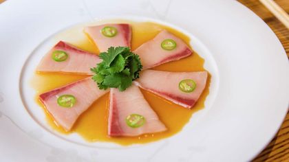
How-To Create Nobu Quality eLearning Experiences Using Visual Design Guidelines
Quincy Conley, Ph.D.
🍿 6 min. read
One of my favorite splurges in life is to dine at one of the famous Nobu restaurants. Why I enjoy it so much is not solely based on the food… it’s also the experience. That experience is something we can take to create better and higher-quality eLearning experiences. But what does a gastronomic experience have to do with the visual design of eLearning? Let me explain.
What is Nobu?
World-renowned chef, Nobuyuki Matsuhisa (Nobu), with over 40 restaurant locations around the globe, is regarded as one of the top chefs of our time. Referred to as Nobu Style, what makes visiting one of his restaurants a delight isn’t just the impeccable service and decadent menu options; it is also about presentation of the food as well as the restaurant atmosphere.
As the chef’s brand suggests, all the senses cannot be separated, they are interconnected. In Newsweek, Chef Nobu’s self-description of his renowned restaurants are that the “... the food and concept are very simple, but always with a twist, like a new product or ingredients and presentations.” His passion is to make his restaurant goers say, “that’s beautiful!” during their culinary experience.
What makes for high-quality eLearning experiences?
Like dining out at one of the finest restaurants in the world, learning should also be inclusive of more than just one or two dimensions of our senses. Moreover, effective eLearning is about how it looks and feels as much as it is about the content. In fact, the visual design aspects of eLearning can improve learning, if we can figure out how to use them correctly, as noted in The eLearning Developers' Journal.
Effective eLearning is as much about the artistic impressions as it is about the instructional content.
There are some notable design guidelines to follow that can help increase the chances of creating meaningful eLearning experiences through visuals, including:
However, one of my favorite easy-to-remember models to use when creating a Nobu-style eLearning experience is C.A.R.P.
Stemming from the graphic design world, thesee are four principles for good visual design, from Reynolds:
- Contrast
- Alignment
- Repetition
- Proximity
Contrast
To start, let's bring it back to Nobu.
One of Nobu’s signature dishes, and a personal favorite, is the Black Miso Cod. One of the first things you might notice in its presentation is the contrasting colors. The cod itself is a light color, with purposeful grill marks. Additionally, there is a nice pink pickled ginger root used to cleanse the palate with green bamboo leafs to add elegance.

How can we create contrast like this in an eLearning project? If you're designing on your own, you can start with these ideas.
First, look to your organization's established style guides or brand color scheme.
More simply, you could also use tools like the color wheel. The trick I’ve been taught with using the color wheel is you should use colors on the opposite side of the wheel to create contrast.
Other methods are to simply use the embedded themes available in a tool like Articulate or Captivate. They usually look nice, so I trust my eyes and build on something that is already done that I feel suits the project. There are no concrete rule (unless you are an artist or graphic designer).
Repetition
There are two reasons why we care about repetition in my purview.
First, because we know people don’t absorb information after encountering it once, we need to present information multiple times in multiple ways for them to learn it. You may have heard of the phrase:
“Tell them what you are going to tell them…
...tell them…
...and then tell them what you told them.”
This is an old adage that is based on human behavior.
The other reason we should care about this principle is because we want to free up the learner’s cognitive resources to focus on germane information, which is where Sweller and other experts believe the learning process actually takes place.
An example where this comes into play is when designing an eLearning module where the navigation buttons are different from screen-to-screen. The action is not consistent so the learner has to think about how to simply advance through the course. This takes away valuable cognitive resources from learning what you want them to learn.
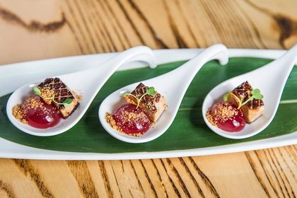
At Nobu, they focus on repetition by presenting dishes in an excruciatingly-detailed way in order to create the same impression on each guest. To provide a consistently enjoyable experience, every bite should be just as delicious as the previous.
Alignment
Alignment is of course related to location, location, location.
You might have heard of the term screen real estate. Just like in real estate, you want to be mindful where things are positioned on the screen so that, visually, things appear organized and ordered.
As an experiment, try creating a screen where nothing is aligned or only one thing is askew. Tell me how easy it is for the eye to pick up on that. It can be distracting.
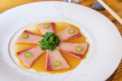
Another international hit that sets the tone at Nobu is the Yellowtail Sashimi with Jalapeño. The alignment between the subtleness of the tuna combined with the heat of the jalapeño combines to create an epic full flavor that would make Kanye walk to Nobu to get it.
Proximity
Proximity relates to creating relationships between objects or information. We usually don’t have a lot of real estate to work with when designing instructional materials. This is especially true when we're trying to create quality eLearning experiences.
So, what we are really talking about is how to create relationships between images and text or images and other images in a tight space without confusing the learner.

To create new relationships for your palate, Chef Nobu often deconstructs some of his signature dishes to accentuate the intended flavors. For instance, using ingredients similar to tiramisu, the Suntory Cappuccino is layered valrhona chocolate almond crunch, coffee cream, whisky foam, and milk ice cream. This technique only heightens the best of the flavors.
Other tips and tricks for quality eLearning experiences
To improve the look and feel of training, there is no one-size-fits-all approach to the design of eLearning, as Steen notes.
You might find it helpful to use an onscreen grid to line up the elements. A common practice by graphic artists is to divide up each screen uniformly into squares. Some design tools even allow you to turn on a grid feature to help with this.
Another tip is to remember whitespace is your friend. Defined as the empty part of the screen absent of content, it is helpful for directing the learner’s attention. If a screen is too busy, it's difficult for the learner to know where to put their eyes, potentially missing the instructional message. Regardless of what method you use to figure out how much whitespace to use, err on the side of providing more rather than less.
A couple of points to hold on to beyond this post are:
- Visual design helps the learning process
- There are different aspects of visual design, including font, color, audio, images, video, and more
- These quick principles apply beyond just eLearning to mLearning and other training situations
In the end, the most important thing is to simply be aware of the visual design of your Nobu-style eLearning projects. For your next eLearning project, I hope your learners enjoy the experience so much they shout out… "Irasshaimase!” Nobu-style.
What methods have you used to create quality eLearning experiences for your employees?
References
-
Akkam, A. (2014, September 8). The 10 Dishes That Made My Career: Nobu Matsuhisa.
Retrieved October 5, 2017, from https://firstwefeast.com/eat/2014/09/nobu-matsuhisa-career-changing-dishes -
Clark, R. C. (2003). More Than Just Eye Candy: Graphics for e-Learning. The eLearning Developers’ Journal.
-
Duarte, N. (2008). Slide:ology: The Art and Science of Creating Great Presentations. “O’Reilly Media, Inc.”
-
Morris, T. (2017, June 5). How architect David Rockwell and chef Nobu Matsuhisa built their perfect restaurant. Retrieved October 4, 2017, from http://www.newsweek.com/2017/06/16/david-rockwell-and-chef-nobu-matsuhisa-built-perfect-restaurant-620881.html
-
Reynolds, G. (2013). Presentation Zen Design: Simple Design Principles and Techniques to Enhance Your Presentations. New Riders.
-
Steen, H. L. (2008). Effective eLearning design. Journal of Online Learning and Teaching / MERLOT, 4(4), 526–532.
-
Sweller, J. (1994). Cognitive load theory, learning difficulty, and instructional design. Learning and Instruction, 4(4), 295–312.
-
Terenzio, O. (2016, June 28). Q&A with Chef Nobu Matsuhisa: On Global Expansion, Good Teams & Staying on the Customer’s Side - Open for Business. Retrieved September 28, 2017, from http://openforbusiness.opentable.com/qas/qa-with-chef-nobu-matsuhisa-on-global-expansion-good-teams-staying-on-the-customers-side/
-
Wall Klieves, L., Orcutt, R., Peters, D. (2014). Eleven tips for visual design and layout. In K. Forni (Ed.), Making learning memorable with graphics and visual design (pp. 9–12). Santa Rosa, CA: The eLearning Guild.
Images courtesy of NobuRestaurants.com
